08 November, 2024
windows
Colourful windows used to be considered a serious faux pas. Snow-white frames reigned supreme, and when we wondered what colour windows to choose, we basically had no choice. Then came the era of dark profiles—black and anthracite. Today, thankfully, we’re no longer bound by restrictive colour norms. Now, we can freely consider which colour matches our façade best and which one we personally like. How do we approach the subject so that the window colours please us?
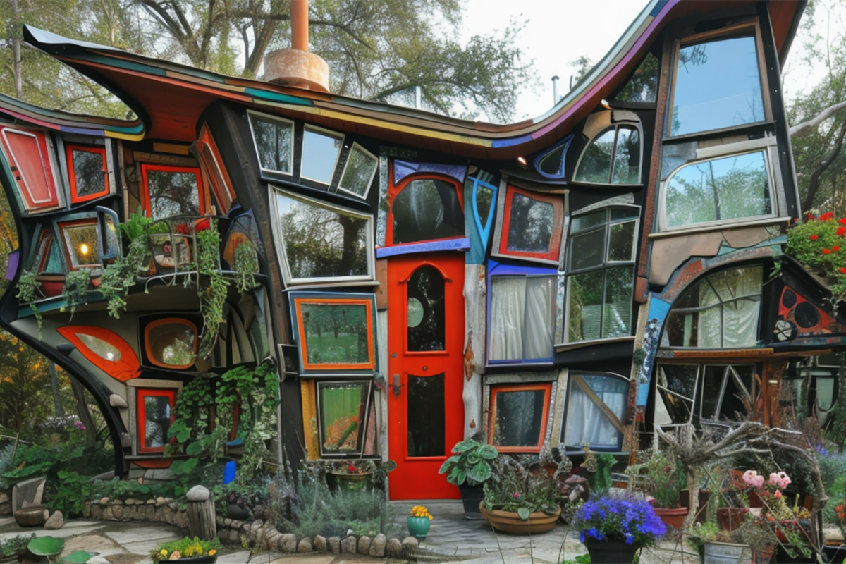
Colour of our window frames is sometimes underestimated, though few investors approach it so carelessly. The colour scheme of our windows affects far more than just our personal aesthetic preferences. In fact, it’s not entirely a matter of personal choice.
The shade of window frames is not solely a private decision. This is generally well-known by owners of apartments in multi-family buildings, but can be surprising for single-family homeowners. However, when considering the broader context, this shouldn't be unexpected.
Every building is part of its surroundings, and it’s important that the whole area has a cohesive aesthetic. For most property owners, the primary restriction comes from local zoning plans. In the case of historic buildings, the conservator's requirements will also play a role.
One option that can help avoid these legal restrictions is dual coloured windows. Although not all systems allow it, where the colour of the window joinery can be different on the outside and the inside, we can forget about regulations. At least for the internal side.
Dual coloured windows on the exterior will comply with local regulations If the law mandates white frames, they can be white on the outside. Inside, however, we can choose our preferred colour: red, green, black, or wood-grain laminates that are nearly indistinguishable from fine wood. It’s worth noting that dual coloured windows can also combine laminate finishes with standard colours.
Modern window profiles are extremely durable, with performance characteristics so robust that even after a decade, we won’t feel the need to replace them for something newer and better. A good window today will still be a good window many years later.
This long-term perspective should reinforce just how important it is to choose the right colour for our windows. An impulsive purchase, random choice, or simply not taking even a moment to consider the choice could leave us with something that bothers us or makes us regret not having something different for a very long time.
Some colours are universally appealing, while others heavily influence the range of options we can combine with them. Choosing a certain colour doesn’t mean we’re restricted from pairing it with others. We can mix and match as we like, but will it look good together? Some colours allow for more compatible choices, while others limit us to a few commonly accepted combinations.
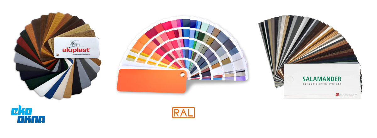
When it comes to window colours, almost anything is allowed today. Window manufacturers have made it possible for customers to choose colourful doors and windows in the exact aesthetic they desire.
Currently, the most popular frame colour is definitely white. But not all whites are the same, and it’s not just about older polymer windows, which tend to yellow under UV exposure.
In industrial design, manufacturers often establish their own standards for white, influenced by the materials and production methods they use. The white of one manufacturer can noticeably differ from their competition. Additionally, a single company may offer multiple shades of white, and even then, the same white shade can look completely different on two separate products.
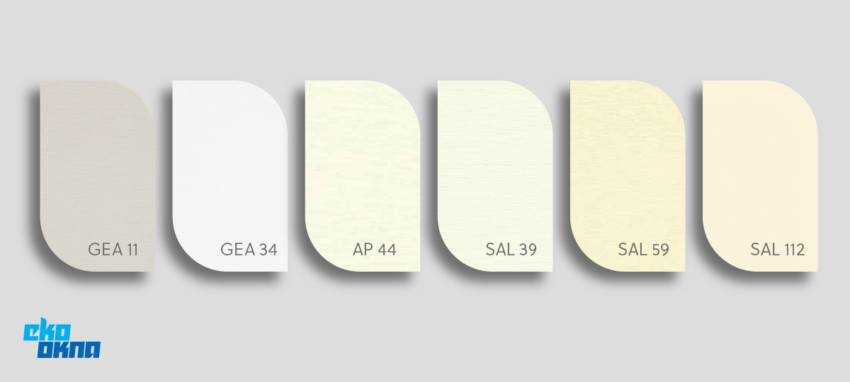
On the one hand, this variety can complicate choices for investors, but on the other, it provides more options. This doesn’t need to be a challenge; if we buy products from a single manufacturer, like the All-in-One Eko-Okna line, the manufacturer ensures everything matches seamlessly, selecting the appropriate shades of white.
Colourful PVC window profiles are created either by mass-dyeing material or through lamination. The latter method is more popular and yields significantly better results. It relies on acrylic glass, which can be richly decorated, is highly durable, and uses a technique of embedding in the white structure of the profile, eliminating the risk of peeling or surface delamination.
PVC window veneer offers another option. By applying veneers, it’s possible to achieve interesting textures, like making window profiles resemble wood or aluminium. This is how PVC windows that imitate wood are created. There’s a wide variety of patterns and colours available, allowing for nearly any look we desire.
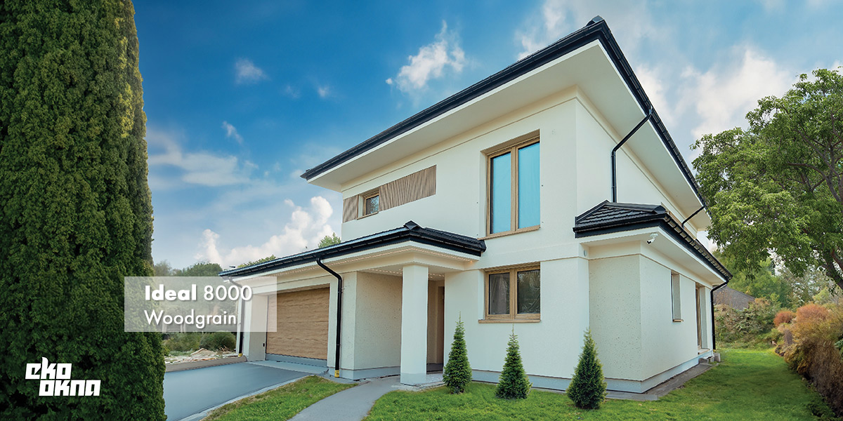
Veneers can also be used on aluminium and steel windows, though in their case, it’s often preferable to use paint finishes in RAL colours.
With colours from the RAL palette, colourful window profiles boast exceptionally vivid and long-lasting hues. The RAL palette is also a reference palette, which means that if you look at a colour chart at the distributor, you can be sure that the colour of your windows will be the same as the colour on offer. This consistency also makes it easier to buy additional products and match windows with doors or garage doors. Although there may be minor colour variances, RAL standards ensure that the match is close enough to be reliable.
The use of veneers is of course possible here, but it is a far less popular option than for PVC windows.
With modern technology, we can confidently say that colour selection only depends on our preferences. If we want a specific effect, there’s almost always a way to achieve it. While legal regulations may sometimes limit us, it’s also wise to consider other factors, such as the cohesion of the entire building project and its surroundings, as well as the impact colours can have on those using the space.

To keep a home design cohesive, it’s useful to follow one of three rules when choosing window colours. These rules are:
The contrast rule involves choosing colours that sharply oppose what’s already present. If walls and the roof are dark, use very light window laminates and colours. If the house is surrounded by light greenery and painted in soft pastels, we might use deep red, anthracite and other distinct, very dark colours.
Harmony emphasises a coherent look of the entire investment. In this approach, if the building is light and sunlit, the windows should also be light, with white being an ideal choice. Black, on the other hand, can complement darker facades. Instead we might choose less elegant, more modest and less striking grey.

The reconciliation of the two approaches above is the accent principle. A colour accent is maintaining harmony with a clear departure from the colour scheme dominating in the façade. This is because we choose colours that are two shades away from the dominant colour. What does it mean in practice? Pairing a blue façade with bold, navy-blue windows. For brick, on the other hand, we can suggest windows in soft pink or orange. This approach keeps harmony while avoiding complete uniformity.
Colours can serve not only as an accent but also as a defining element of a design. Each colour carries its own psychological and cultural significance.
Pastels evoke warmth and calm, while vibrant, highly saturated colours like ruby red are bursting with aggression and energy. White is serene, universal, and sterile. Black is elegant and stately but a little bit boring.
In addition, the colours are linked to certain architectural styles, in which they are best suited. No colour is limited to just one style, although certainly with specific styles certain window colours are worth considering before others.
This is only a very general outline of basic trends. Especially since dual colour windows allow for an exterior effect that can be completely different from what we achieve indoors.
Moreover, classic versus modern windows differ in more than just colour; details like the shape of glazing beads, sash alignment, and drainage preparation all contribute to a window’s unique look. It’s no coincidence that Eko-Okna offers such a wide range of systems that may look similar but deliver different visual effects.
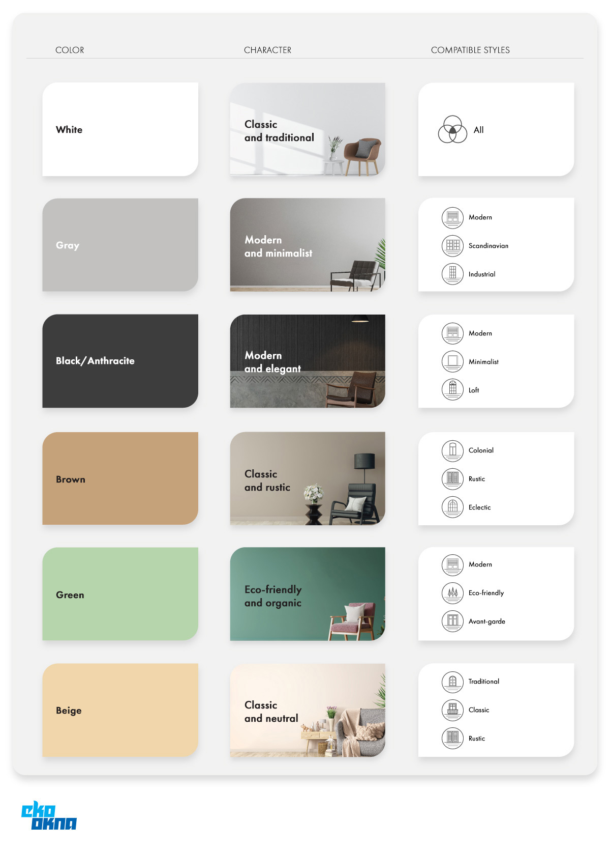
Traditionally in our blogs, it is decision time. We know everything we should know, so it's time to translate new information into practical real-world solutions.
Making a decision based solely on theory could lead to parlous results. It’s wise to test recommended colours in practice.
While it’s not possible to install multiple windows and doors on a trial basis, we can examine other investments, review colour samples, and even look at "triangles” and "jaws”, small sample models of products we may purchase. Larger distributor showrooms often display entire constructions composed of different elements.

Manufacturers guarantee that the final product will look just as it does on the showroom sample, and we have every right to expect that consistency.
A crucial factor to consider is sunlight exposure. Heavily sunlit areas will look different than shaded ones. It is important to remember, as dark colours will appear even darker in low-light settings.
Durability is another important problem. UV radiation is damaging to any material. Current solutions offer effective protection against fading, but these aren’t always standard. If a coloured window is being installed on a south-facing wall, and we don’t want it to fade quickly, make sure it’s protected with UV-resistant technology.
We may also want to consider window covers, which add aesthetic value to the building and can either harmonise or contrast with other components.
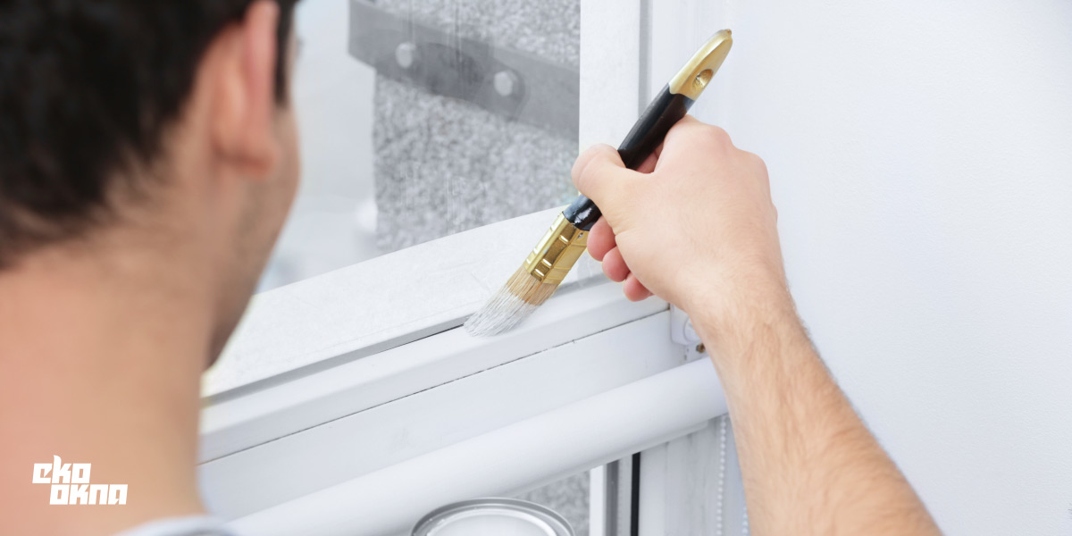
For wooden windows and doors, maintenance is essential. Wooden products require more upkeep but provide a unique aesthetic. Restoration paints allow us to modify the appearance, giving some space to experiment. Though a black window can’t turn white, we can adjust its tones.

Hotline: +48 32 459 15 00 Contact for new business customers only. Connection fee in accordance with the operator`s price list.
E-mail: quoteuk@ekookna.com newclientuk@ekookna.com Contact for business customers only.
Eko-Okna S.A.
Kornice, ul. Spacerowa 4
47-480 Pietrowice Wielkie
NIP: 6391813241
KRS: 0000586067